Reimagining customer experience at The Hague Municipality
The municipality of The Hague is developing its public services throughout the entire organization. Part of this development is the re-design of the Atrium of the City Hall, which needs to be converted into a customer-centred space.
TEAM
5 Designers
DESIGN AREA
Service Designer
YEAR
2019
I. research
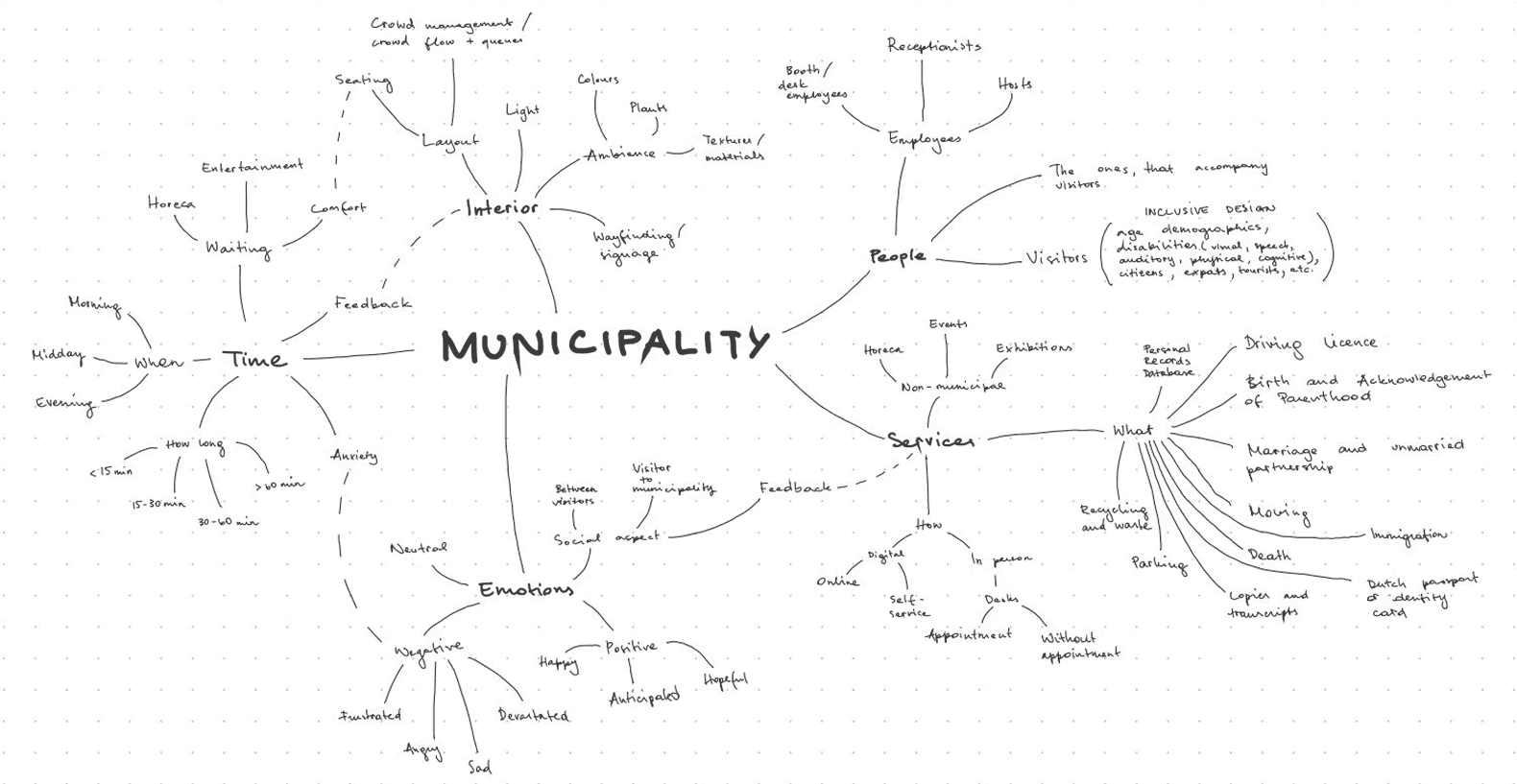
The aim of this paper is to show how visitors of the municipality’s Atrium experience their visit, and where it takes place in. It also investigates what kinds of challenges they encounter and how they resolve them when completing their tasks.

Desk Research
With material provided by the municipality, including architectural layout, ratings of their services, analytical statistics and general info about the city.

Competitive Analysis
With other cities, such as Barcelona police office, Alkmaar city office, and Het Kielzog cultural & municipal complex.

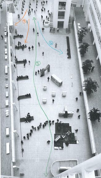
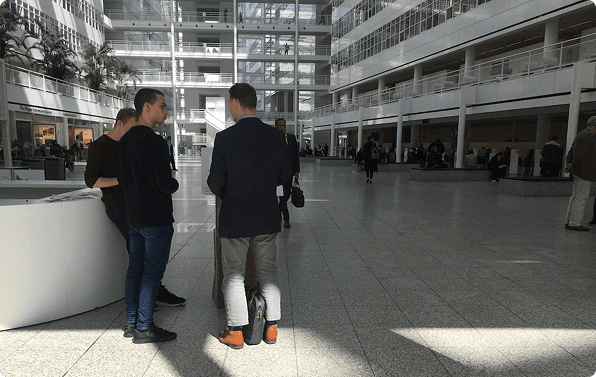
On-Site Observation
With a mix of methods such as behavioral mapping based on a time-lapse of the space, fly on the wall, and artifact analysis.

User Interviews
To inquire visitors about their thoughts and perceptions as they were entering and using the space.

Reaction Cards
After using the services, the user was shown several cards with different emotions that (s)he could choose & talk about.
II. user insights
Key findings obtained after data analysis & interpretation.
Feeling of the city hall
Visitors experience municipality’s services and atmosphere as pleasant, albeit they are missing a homey and comfortable feeling in the building. Compared to other municipal buildings, they feel the atrium is too cold and unwelcoming and would benefit from a warmer and more comfortable design.
Wayfinding issues
Visitors experience problems with wayfinding in the building. They need help from the hosts and the reception, to find their appointment locations or know what to do next in their process. This is due to unclear signage and the spread-out layout of the services. Visitors describe it as non functional and impractical.
Unclear touchpoints
The touchpoints are the ticket machine, the reception, and the hosts. It is not clear to everyone which touchpoint they should approach first, which causes confusion. Visitors do experience the interaction with the employees of the municipality positively and report useful and meaningful interactions.
The research results show three main areas that a design could focus on from this point on:
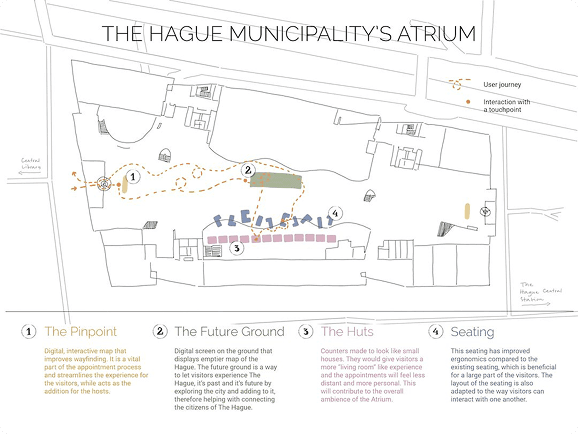
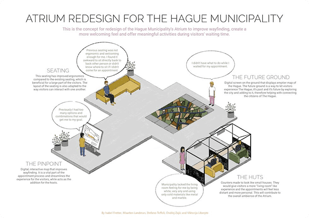
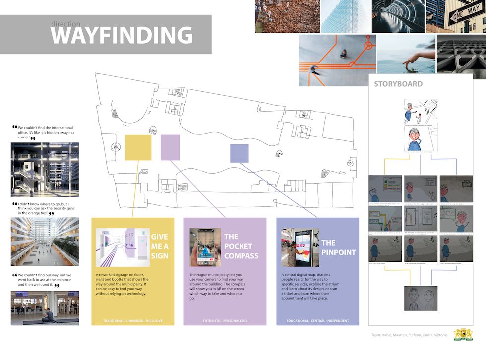
Wayfinding
Making it easy and intuitive for visitors to find their way around the infrastructure and the municipal services.
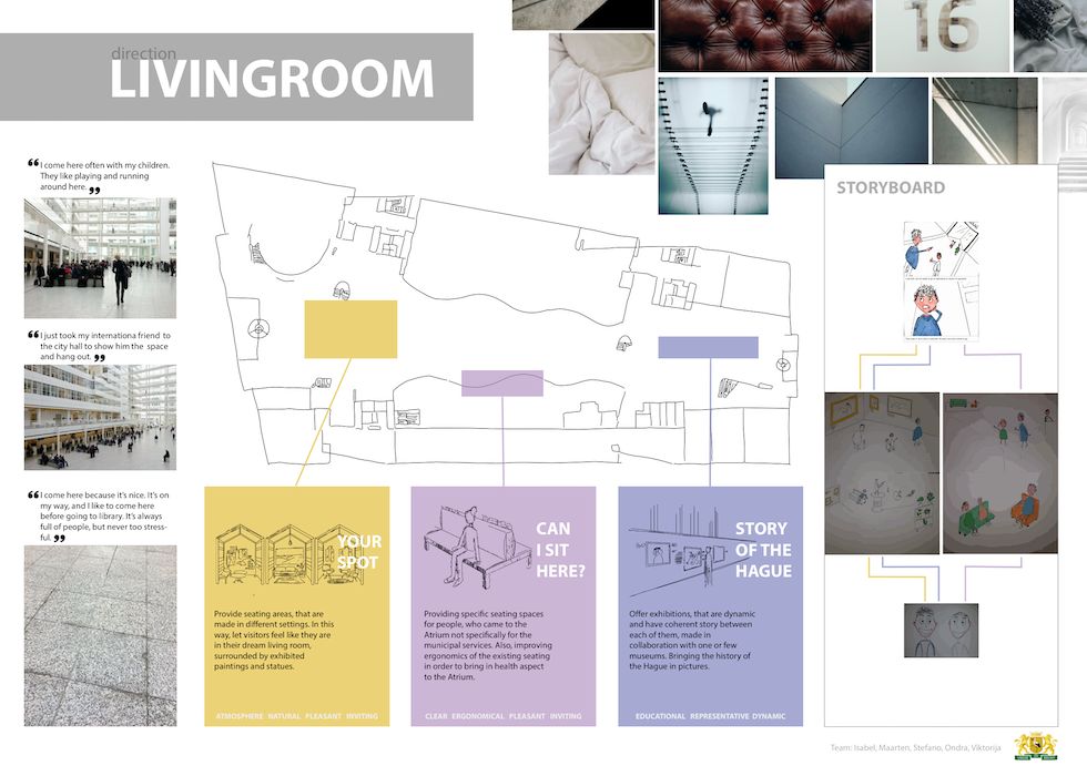
Living Room
Emphasize the clients wish to represent the city in the design and use the available space to display the history and culture of The Hague.
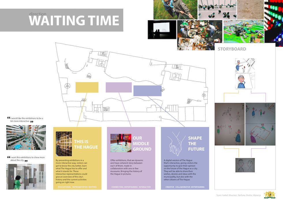
Waiting Time
Making the time that visitors spend in the atrium comfortable and fun, whether they are waiting for services or relaxing.
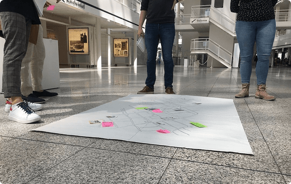
III. ideation
After brainstorming with mindmaps, each member created and presented 2 concepts. They have been evaluated by the team and grouped together by similarity and, based on our research, three design directions were taken: easy wayfinding, make the atrium look & feel like the “living room” of the city, and make the waiting time more engaging.
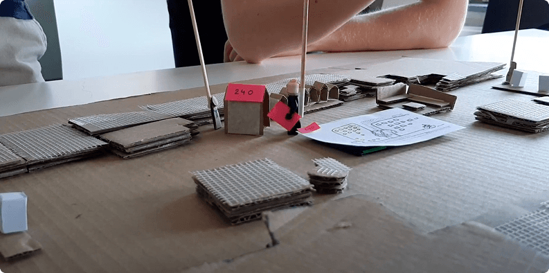
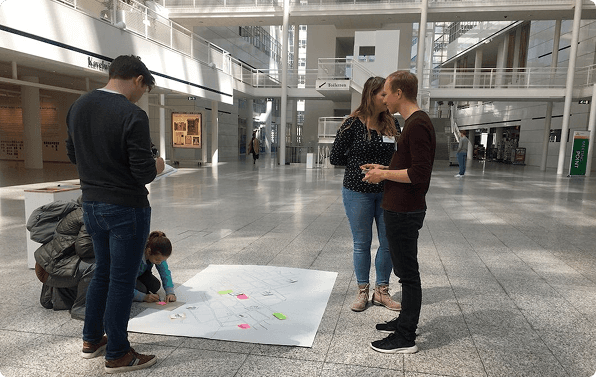
IV. prototypes & tests
A mix of prototyping techniques to iterate as effectively as possible. We started with a cardboard prototype, followed by a life-sized one, and the final prototype was tested in real-context.
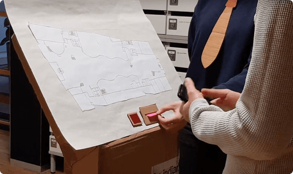
01
Desktop Walkthrough
A cardboard 3D model of the atrium
User Scenario
After host assistance right after entering the atrium, the user will be guided to the machine where they will get their ticket, if the booked in advance. To facilitate the wayfinding, the user can scan the ticket on the pinpoint which will display the exact destination on the map. If the user does not have an appointment, the machine will guide them towards the reception where they can book a slot.
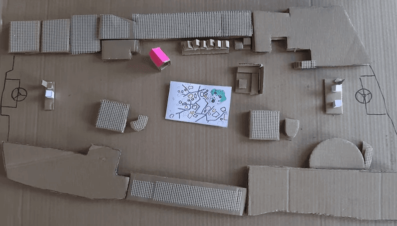
Key Finding
It provided an essential experience, but the services needed to be more clear and improved. The main improvement was to combine the interactive map with the ticket machine in order to reduce the number of touchpoints.
02
Service Staging
A life-sized prototype with fictional users in a controlled environment
User Scenario
After host assistance right after entering the atrium, the user will be guided to the machine where they will get their ticket, if the booked in advance. To facilitate the wayfinding, the user can scan the ticket on the pinpoint which will display the exact destination on the map. If the user does not have an appointment, the machine will guide them towards the reception where they can book a slot.
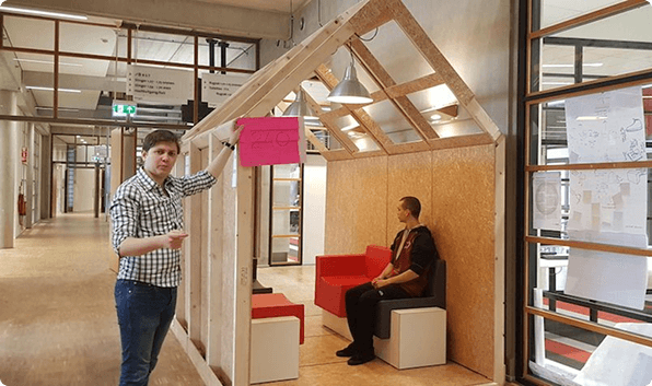
Insight #1
The wayfinding & ticket machine was in need of a more self-explanatory interface for the user to interact with.
Insight #2
It was not very clear for the user where to go, mainly due to the landscape map orientation that could lead to confusion.
Insight #3
The interactive map needed to have more clear and intuitive instructions.
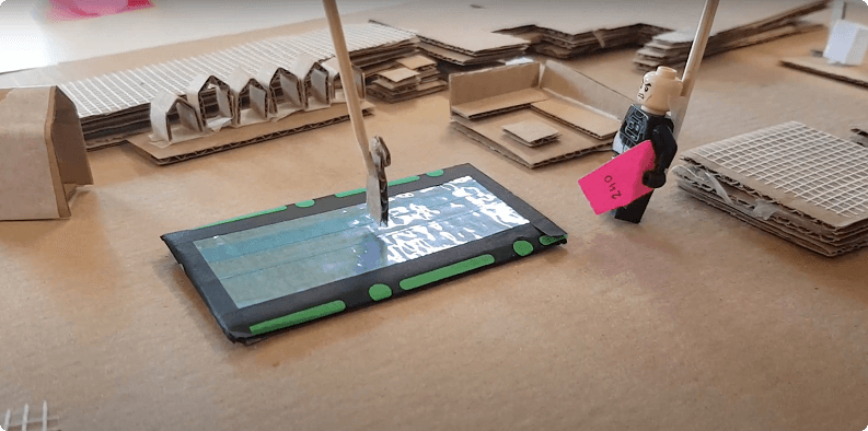
03
In-context Prototype
Final prototype at the municipality, testing our cardboard & paper prototypes with real visitors.
User Scenario
After host assistance right after entering the atrium, the user will be guided to the machine where they will get their ticket, if the booked in advance. To facilitate the wayfinding, the user can scan the ticket on the pinpoint which will display the exact destination on the map. If the user does not have an appointment, the machine will guide them towards the reception where they can book a slot.
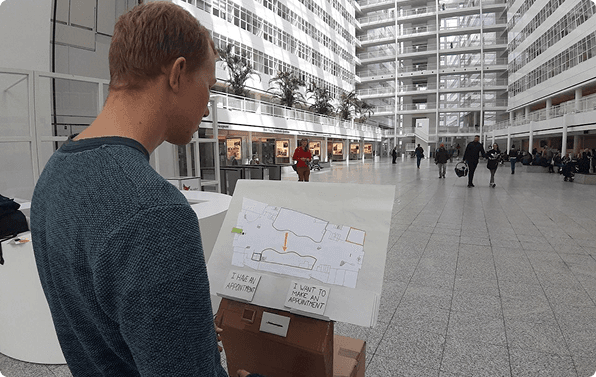
Key Finding #1
Users need to have the possibility to scan a QR code as first step of their process, as they find it the most comfortable way to initiate their flow.
Key Finding #2
Some imagery or icons were not intuitive for visitors: more text was added in order to make everything more clear; a missing back arrow has been added in a specific screen.
Key Finding #3
For the waiting time, visitors were happy to have the ability to give their opinion to the city, on the other side, they would like to have more thinking time instead of writing them on the spot.
V. client handout
That has been delivered together with the presentation of our solution.