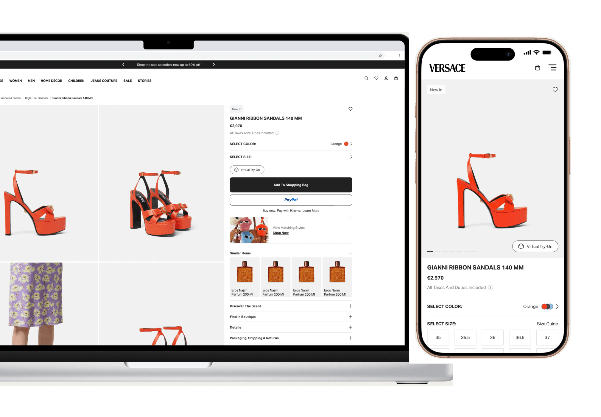
Product Detail Page Reskin
the business needs to give a fresh new look to the product detail page. With a condition though: we can't introduce new components or features, only UI updates allowed.
ROLE
Digital Brand & UX Designer
DESIGN AREA
E-Commerce
GO LIVE
Oct 29th, 2025
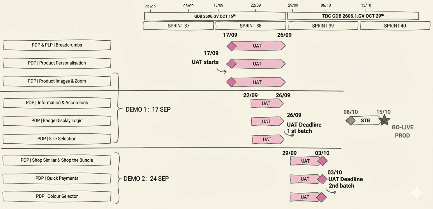
I. timeline
On the left column each component of the product detail page. On the right, the development roadmap together with user acceptance testing. Time allocation for design was 4 weeks.
II. scenarios
Shoes have virtual try-on, bags don't have sizes. Bathrobes have personalisation, tableware has a quantity selector.
Key product categories are mapped to make sure every variation is taken into account while designing.
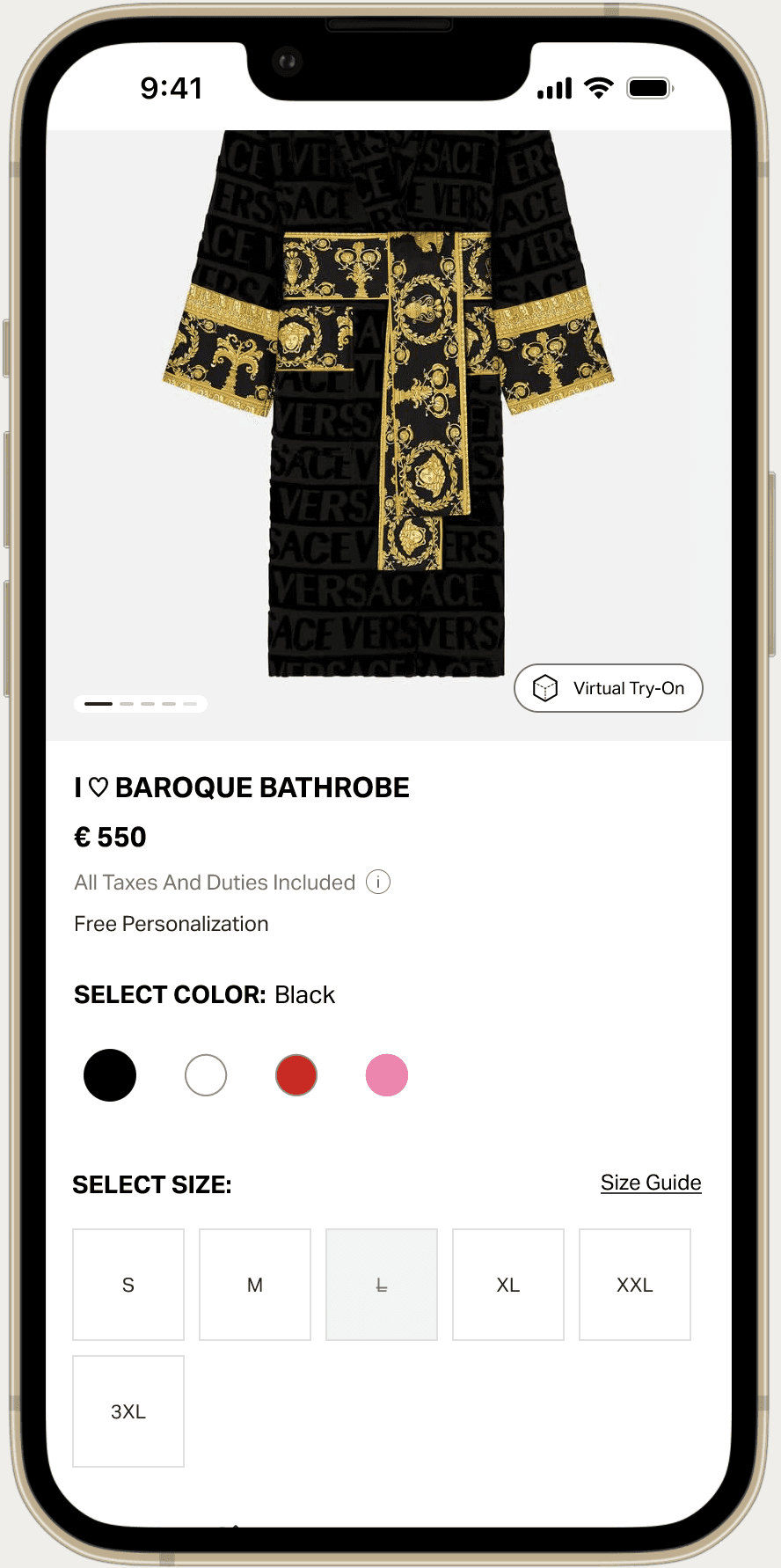
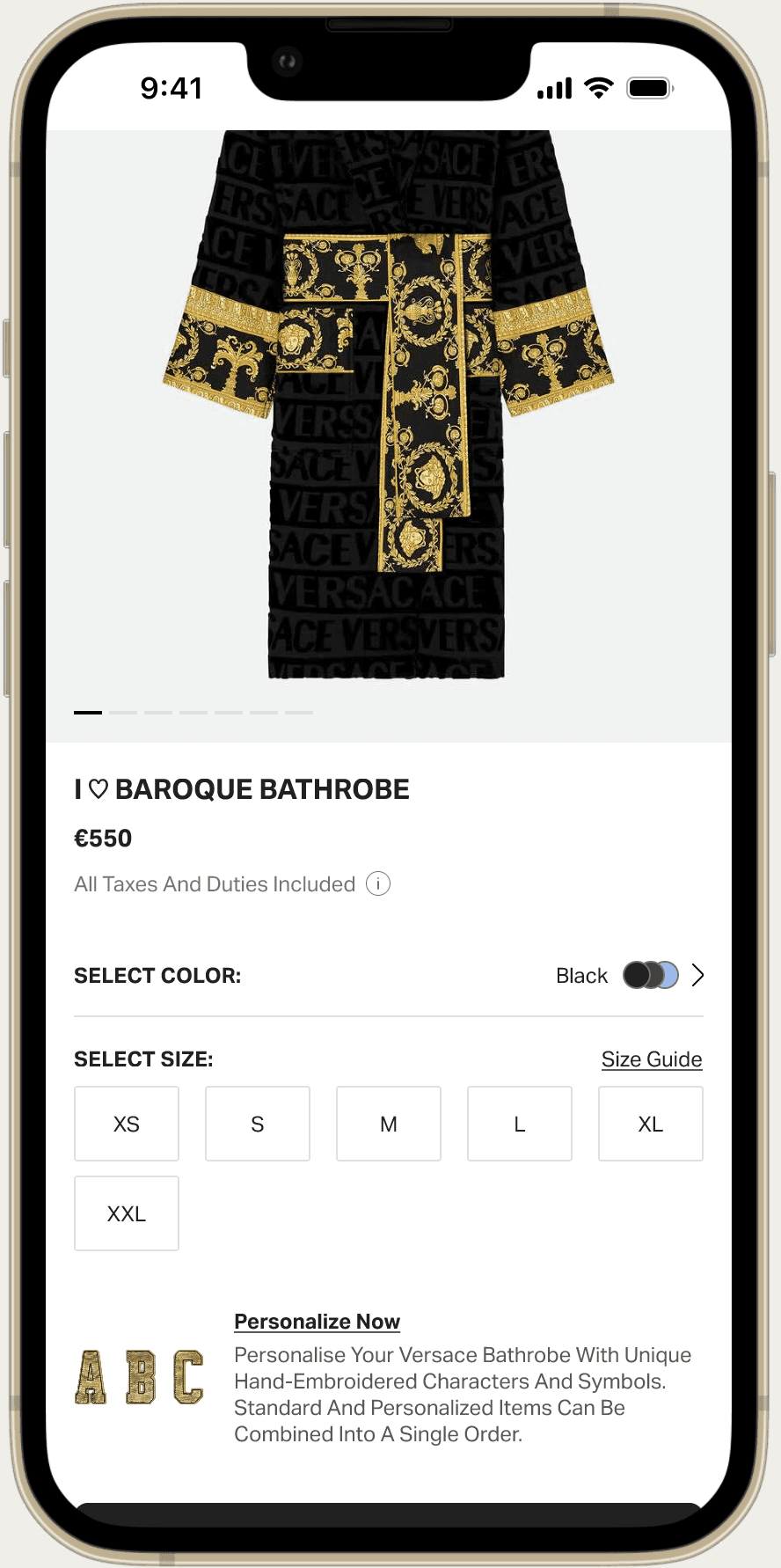
BATHROBES
+Personalisation Label
+Personalisation Trigger
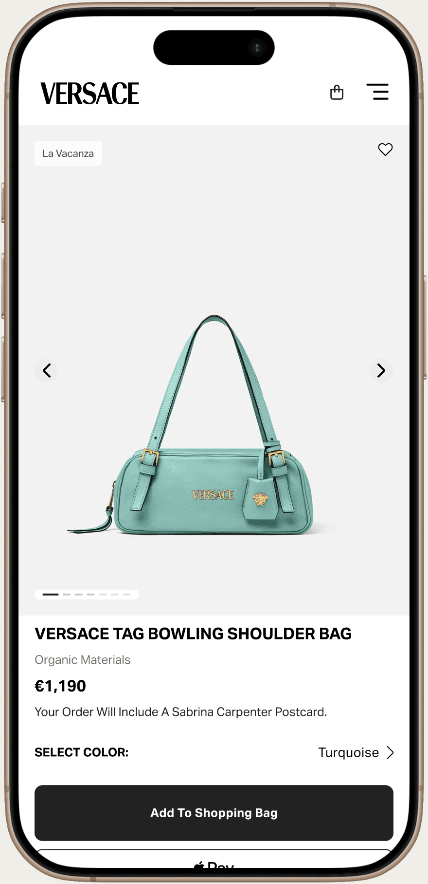
BAGS
-No Size Grid
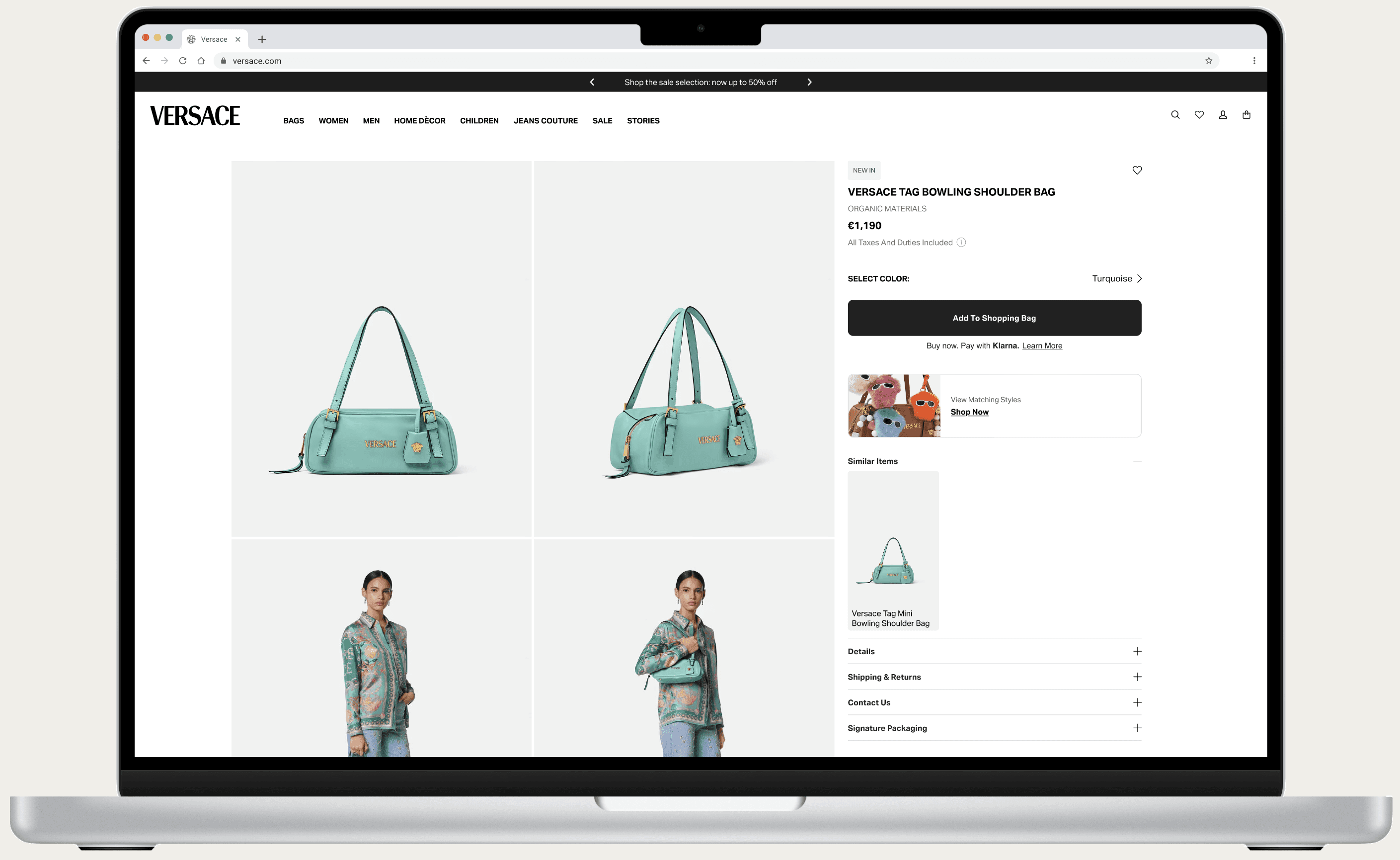
+"Similar Items" Component
SHOES
+Virtual Try On
+Pre-Order
TABLEWARE
+Quantity Selector
+"Matching Styles" Component
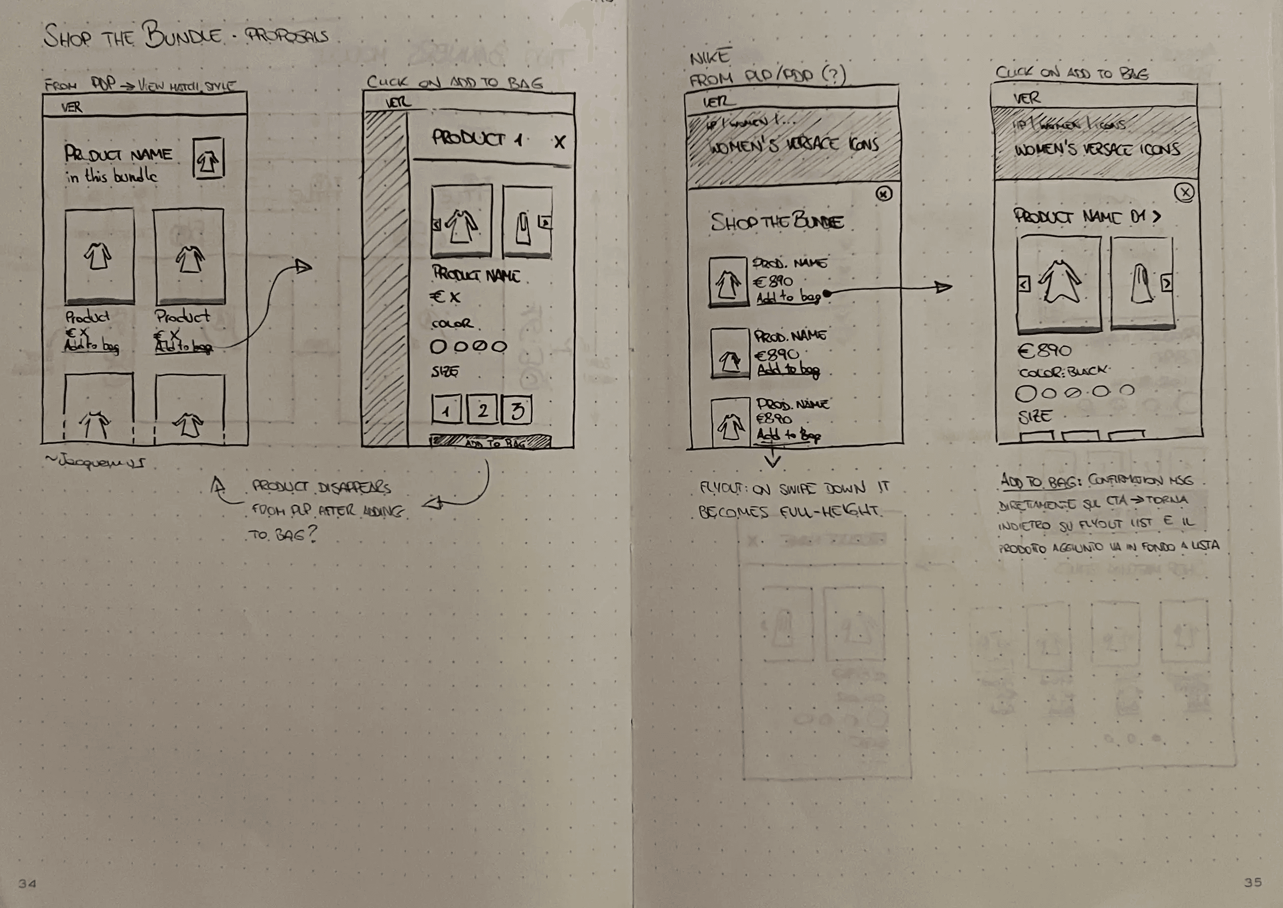
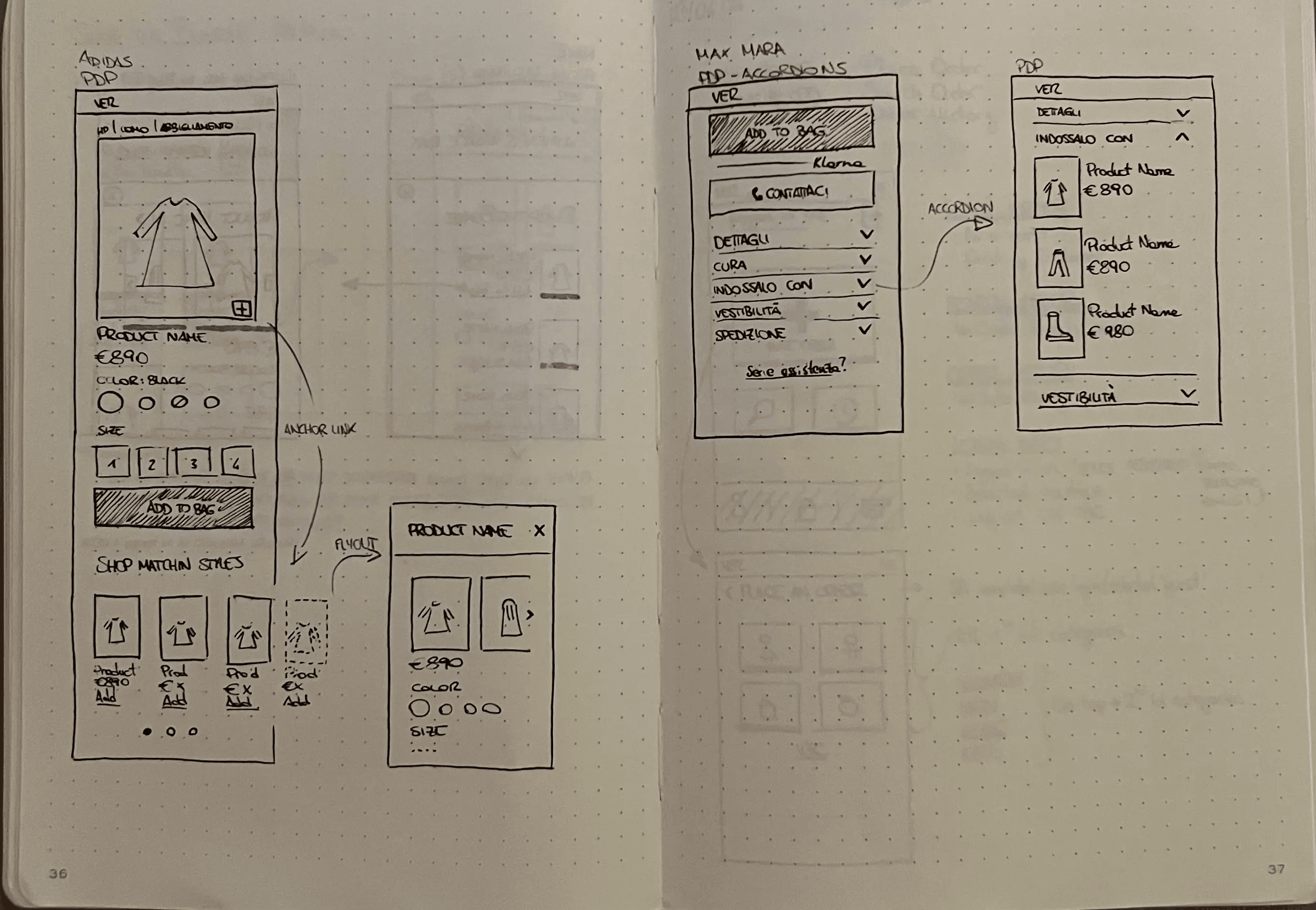
III. ideation
It started with some benchmarks, continued with pen and paper, and then I moved to Figma
IV. improvements
Key updates to single page elements
Image counter consistency with PLP
Product tag visibility
Spacing distribution
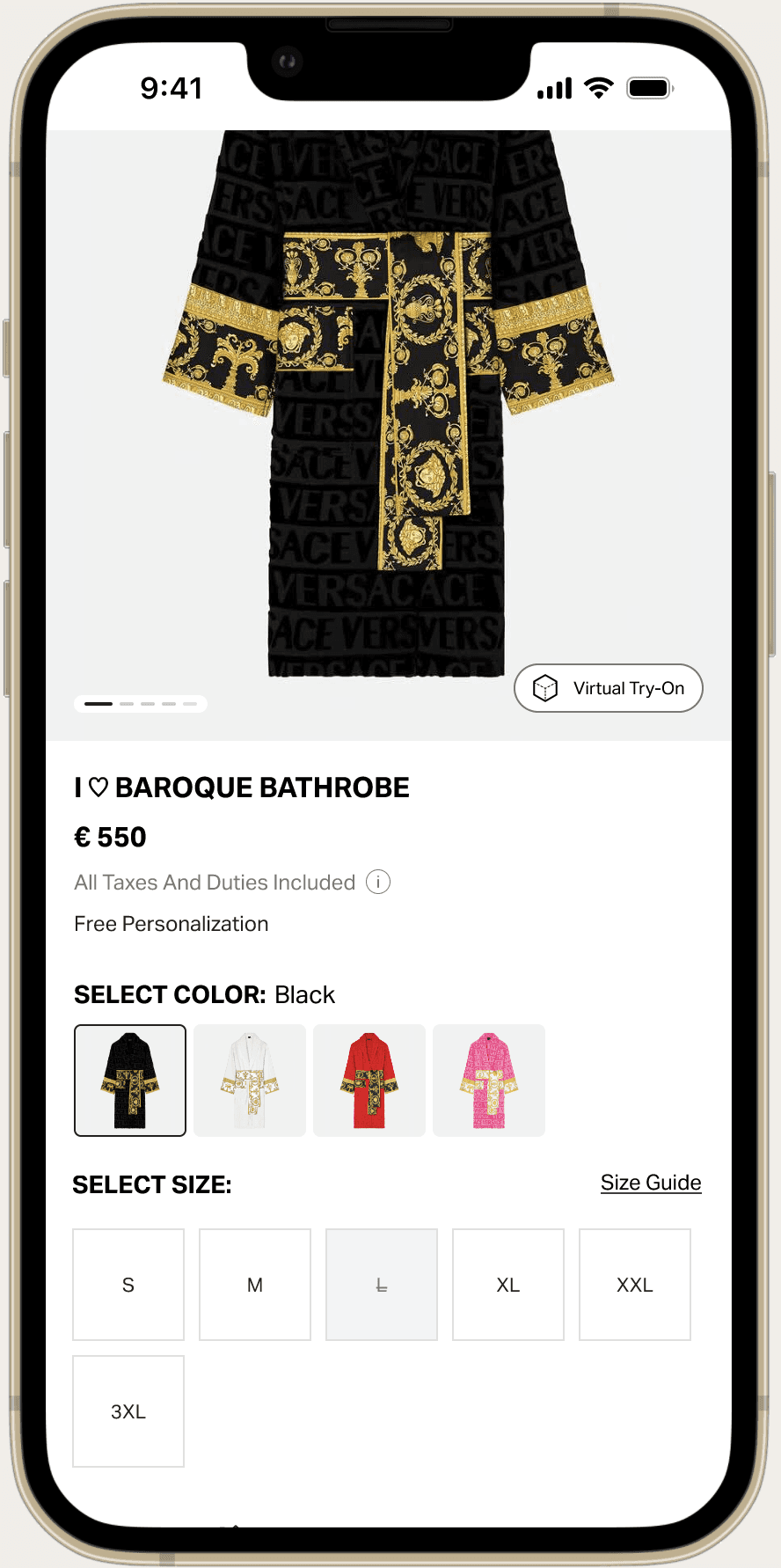
Colour Thumbnails instead of swatches
Size box dimension optimisation
CTA styiling update
Personalisation input styiling update
Fast Checkout CTAs
Accordion Drawer instead of Dropdown
V. a b tests
Virtual Try On visibility, Size Grid selection, Accordion content layout are some tests we performed with this project. Below, a two-variants example for color selection:
CONTROL VERSION
Colour Swatches
B VERSION
Color Thumbnails
C VERSION
Bottom Color Drawer
The C version won. It did not improve financial KPIs, but users enjoyed navigating the page for longer. It turned out also a clear preview of the product variation without having to load a new page.
VI. presentation & stakeholders approval
It started with some benchmarks, continued with pen and paper, and then I moved to Figma
VII. accessibility check
To make sure all our users can navigate our website with no frictions

Colour Contrast
Keyboard Functionalities
Focus Element
Screen Reader
VIII. developer handoff & bug fixing
After business and technical user story signoff, devs work begin. I delivered a Figma project file, with artboards divided for each story. This was a request from devs to facilitate the QA work. Once the developed component is ready we start testing it - Jira tickets are used for both bug reporting and user stories.
IX. metrics
KPIs are constantly monitored, even after releases. Here's the most interesting ones:
bounce rate